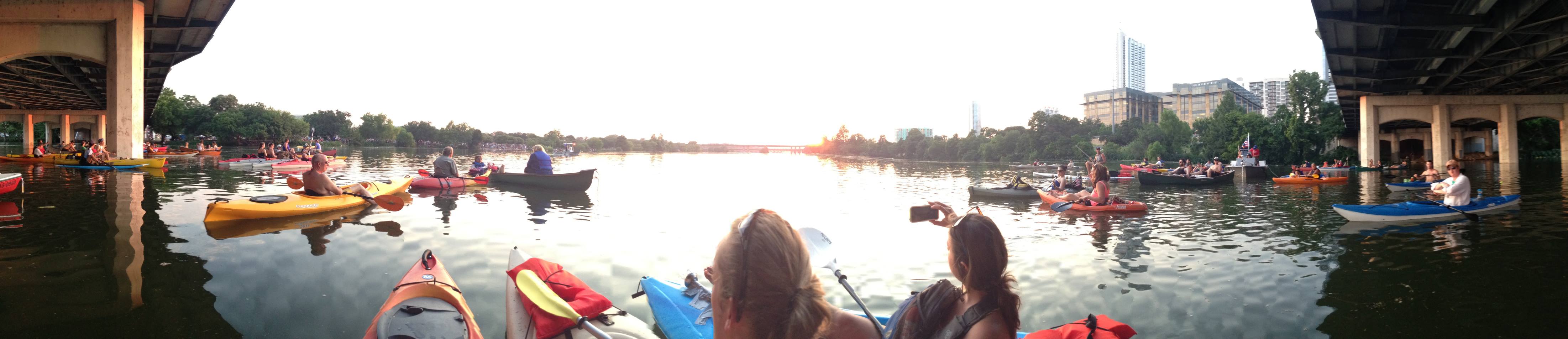
For Project #3 I will be making a site about kayaking. With spring around the corner, this will give me an opportunity to get outside on my kayak more frequently to get some good photos and video to share on my page in addition to some general information about kayaks, where and how to buy them, and the best spots around central Texas to go kayaking.
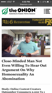
The Onion has a very well and simply designed responsive website. The website maintains emphasis on the photo at the top of the page and compresses the articles beneath it as the page contracts on a large monitor. As the page expands the menu bar appears, followed by side-bars with videos and advertisements at maximum window size. The iPhone version of the website looks identical to the compressed version of the page which I found interesting. I am assuming once you reach a certain pixel width equal to that of the iPhone it takes on the same layout.
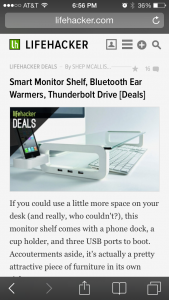
This is a pretty cool web page with all kinds of advice to make life more manageable with its life-hacks. The page has a cool menu bar with icons for different devices that disappears as the page shrinks. As the page shrinks further the headline article takes a more prominent position at the top of the page that looks just like the iPhone presentation of the website with a vertical layout of articles. The one consistency is the LH logo in the upper left corner on both devices in all sizes. Check out this website for some pretty cool ideas like how to make the best bacon possible: Bacon Hack.
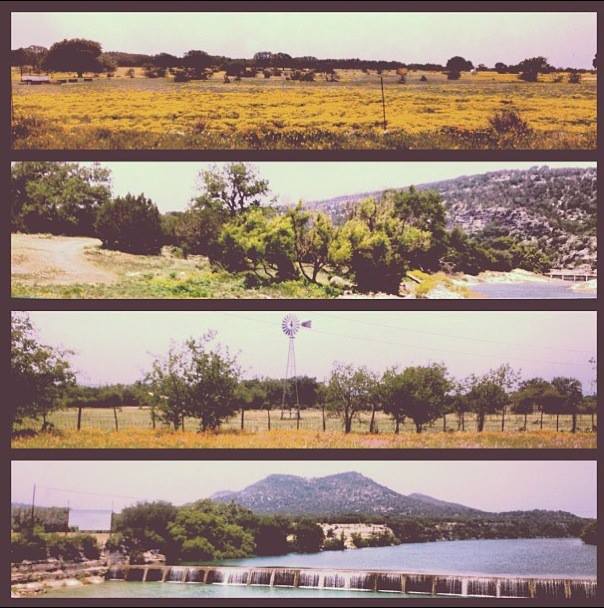
For Project 3, I am going to make a website about my favorite hobby, exploring! I will post pictures, location information and specific information about the hikes and drives I explore around the Hill Country.
Scenic drive from San Marcos, TX- Midland, TX
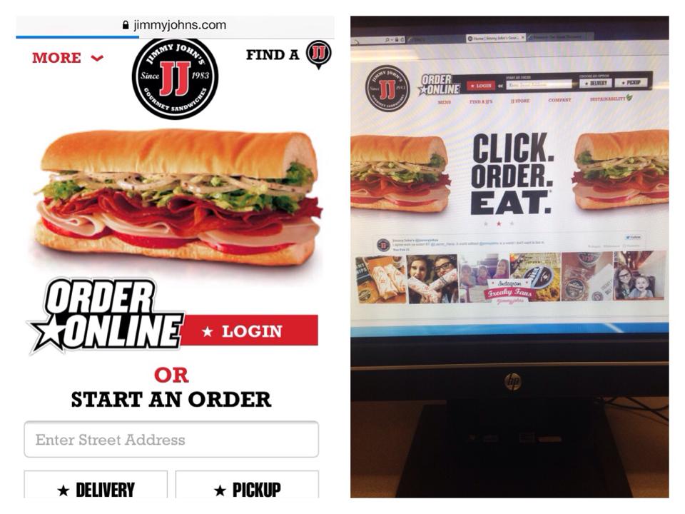
The first mobile-friendly site I chose was for Jimmy Johns… which I use all the time. It has definitely evolved since online ordering started taking off. I remember not being able to get my address to show up correctly, submit buttons not working and pages freezing all the time. Over the past few months they have updated the site, and now I never experience any problems. Jimmy Johns is an example of a responsive site, because it uses the same basic layout and just repositions items on the site to fit whatever device you are using. The site has 2 different layouts, one for using the full desktop screen, and then one that changes when you shrink the window on your desktop to a more streamlined version: this is the version used on my iPhone, too. The sites change enough to optimize your experience for using the site on a mobile device, but it keeps that same theme on any device you are using to view the site.
The full sized desktop site has an order online area at the top, a navigation bar and a logo at the top of the page. It also has more graphics, shows the recent tweet from @jimmyjohns, and shows pictures tagged with #jimmyjohns on Instagram. The site also gives you the option to add Jimmy Johns on Facebook, Twitter, Pinterest, YouTube and their blog.
The more streamlined version, for smaller windows and mobile devices, has the most important parts of the website on the homepage. It has a tiny logo at the top, a tiny icon for finding a location, it has one graphic, an order online area, and then the navigation menu at the bottom of the screen.
Jimmy Johns mobile site vs. desktop site
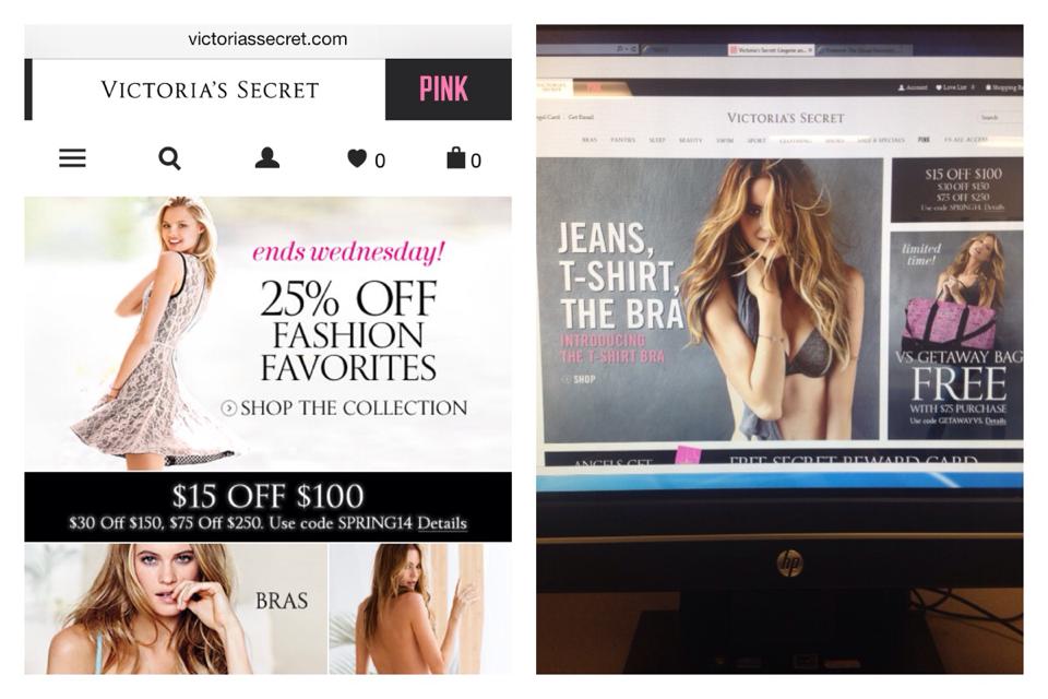
Victoria’s Secret is a good example of a dedicated web site. The desktop version stays the exact same size, no matter how small you make the window you are viewing it in. The desktop site is broken up into sections, each section has a picture of a model with some text and links inside them. The text is mostly advertising some sort of deal like “Free Shipping on Swimwear” or “25% off” and then they link you to areas of the that relate to the deal. They have an area that allows you to sign up for special offers, to login to your account or to search the website for a specific topic. They have a navigation menu for all of their Victoria’s secret products, and another separate navigation menu for all of their Pink products. At the bottom of the website they have limited edition deals, information about the VS credit card, Account information, Customer Service, links to download apps for separate devices and a subscribe area. Also, they have links to the official Victoria Secret Facebook, Twitter, YouTube, Pinterest and Instagram pages.
The mobile site for Victoria’s Secret is much more streamlined than the desktop site, but it still has almost all the same information. It has the separate tags for Victoria Secret and Pink products, and underneath those tabs it has small icons to show where you can click to see a whole menu, where you can search, your profile, what you like and what is in your cart. Instead of advertising all of their deals they just have the pictures of the models as links to get to the bra, panties, clothing and swim areas. I personally think they should have stuck with showing the different deals, because that is what most people are interested in when shopping. Then they have all your account information, card information, App information and Subscription information at in a drop down menu. I feel like the mobile site has a little too much information on it, and they could have done a better job at only putting the most clicked areas on the home of the mobile site. Even though there is a lot of information, they still did a good job at organizing mobile site, with the most important information toward the top of the page.
I will do a hobby site. I would very much like it to be about my crocheting, although I know you said it should be different. On a limb, I am outting myself as a total loser: besides work and school, I don’t really have any other hobbies besides playing with string and turning it into useful objects and wearable garments. Insert frown face.
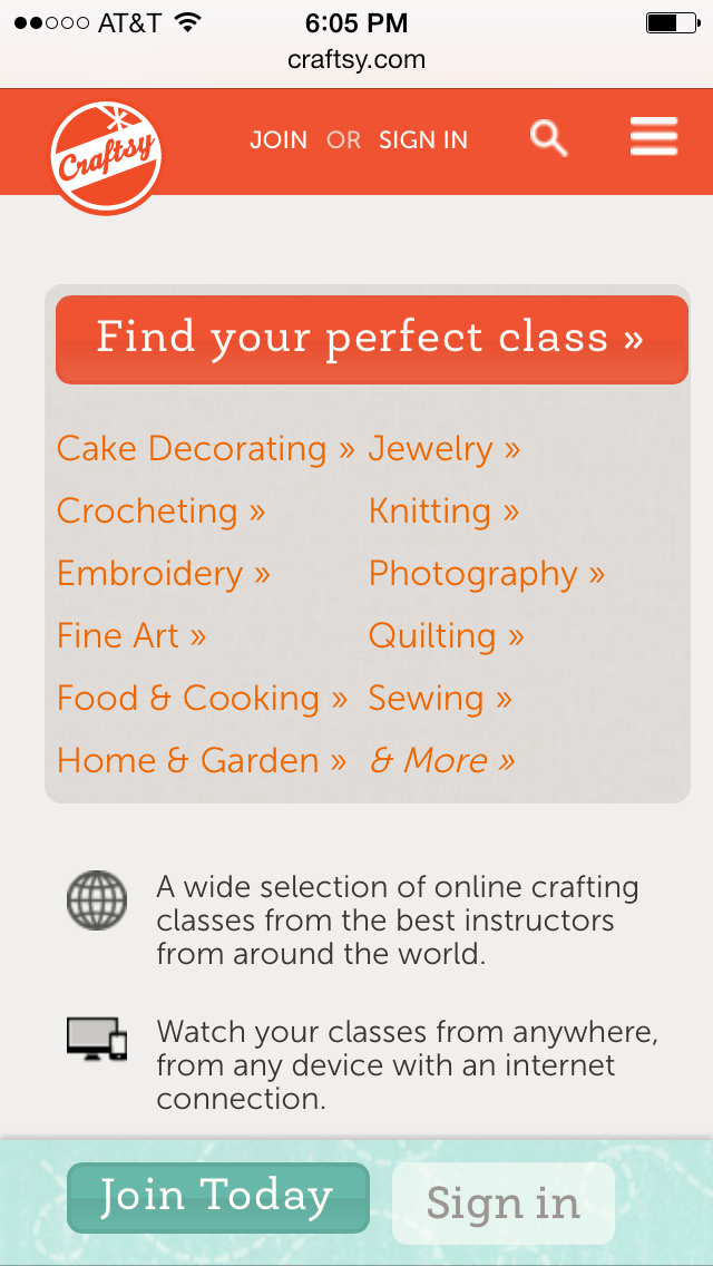
Craftsy is a really fun site that makes me feel as excited as I was when I was a kid watching Saturday morning cartoons. There are tutorials on every kind of artisan craft you could imagine, and more are being added every day. I was happy to learn they have a great, responsive web design that adapts to your browser size. No device detection appears to be at play, since browsing the site from my iPhone showed me the same format.
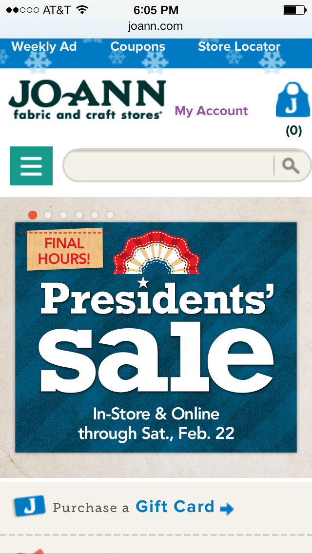
Jo-Ann’s website is also responsive, but the large banner at the top of the homepage doesn’t scale down with the rest of the site and navigation. It remains huge at the top of the screen when you decrease the browser size on a desktop. However, when browsing from a mobile device, it appears device detection serves up a differently formatted banner.
Knitpicks.com is one of my favorite sites to buy yarn. It is easily navigable, and I can always find what I’m looking for quickly. The alternating web banners on the homepage entice and inspire knitters and crocheters with brilliant colors, high quality photographs, and relevant copy that invites the shopper to click deeper into the site. The copy and overall structure of the pages provide enough contrast so the shopper can easily click and browse without struggling to read. I consistently browse this site because of how easy it is to use and find what I might want to buy.
Eat24 is my favorite way to order food delivery to my apartment when I’m completely occupied with work and school. The search bars to locate restaurants that deliver to your house are the most prominent thing on the page. There isn’t a lot of clutter on the site either, keeping the viewer focused on the matter at hand: locating food for the tummy. Throughout the ordering process, the menu is extremely easy to use, and the copy is short and to-the-point, providing a fast and easy experience. Although the website design isn’t “responsive,” their mobile app provides mobile users a fast and easy way to order food as well.
Magda Sayeg, from Austin, TX, is one of my favorite artists. She designs and executes large-scale knit and crochet art installations, usually in very public places like downtown Austin, the Google building in NYC, or even Etsy’s headquarters. I’ve always loved the layout of her site. The simplicity of the layout provides a stark contrast to the vibrancy of the images of her installations, inviting the viewer to click through her gallery. Because of the lack of clutter, the navigation floating at the top right is easy to find, although not distracting to the images below it. Although her “Store” link doesn’t work, overall it’s a great website for an artist.
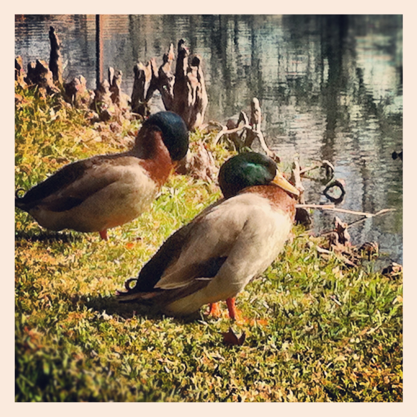
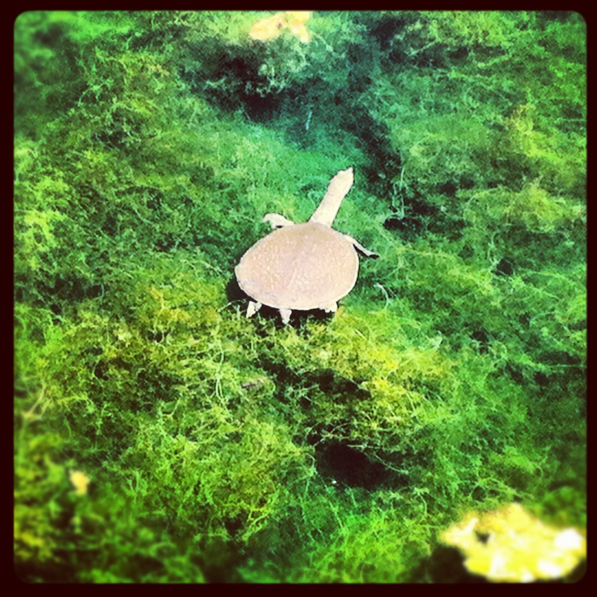
Texas State Culture Pics
I chose these three photos because I took them during my first few days at Texas State. Every morning, I parked in the commuter lot at Strahan Coliseum and walked through Sewell Park, J.C. Kellam, and up the hill to Old Main. I would get so excited about spotting wildlife, and I took pictures whenever I could. This is one of the key memories I’ll have when remembering my time at Texas State University.
Photo by Taylor RichardsonPhoto by Taylor RichardsonPhoto by Taylor Richardson
Apple is well respected for their attention to design, and their website is no different. Clean and minimalist and very, very focused. They mostly use a centered alignment for the elements on their page and everything is grouped together in a coherent way. They use a varied mixture of text, pictures and videos to sell their products and the design elements of each page, which are unique to their function, all use the same, sharp, minimalist theme.
Ars Technica is one of my favorite science / tech blogs; they have some of the best technical and specialized writers out there. Their website — built on WordPress, I believe — is also very well designed, using a dark, heavily customized theme. It’s a very text-heavy site, left-aligned and the articles are grouped together with specs, pictures and contrasting headers.
The Verge is another great tech blog, and they use a much more experimental, modern design than either Apple or Ars Technica does. They don’t seem to care too much about optimization — you must be prepared for very long load times if you want to read this blog! But they seem to want their website to imitate the feel of a high-tech magazine. Their content is also very text-heavy and left-aligned, organized in blocks with various sizes and very interesting to look at, although maybe a bit cluttered to the eye.
This website is awesome, but I might be biased because of how much I love the show! The colors pop, there is a cohesive layout, and it is funny. The links are in cool fonts that look like highlighted crayon when you scroll over them. There is easy navigation to their music and video pages along with tour dates. I like this websites simplicity and how well it captures the playful nature of the show “The Flight of the Conchords.” Be sure to click on the “Ultra-High Fidelity Music Box” to pull up the music player and make the tape recorder dance. Very interesting way to present music on a website, I would like to learn how to do this. Pretty sure it is a flash feature. They also have a “Chords & Lyrics” page which I found really intriguing as a musician/songwriter/guitarist to learn their songs with ease.
Hilarity…
Quote: “I’m not cryin’. It’s just been raining… on my face.” – Jemaine
I really like Jack Johnson’s website. The sites elements are aligned well and the colors of the text contrasts well against the wood-grain background. This site also does well representing the mellow vibe of his music and lifestyle. I personally like the rustic wood style of the page as you can tell by my own website Jeremy-goble.com. I also like video box on the home screen so it is easy to see and hear his most recent material. I also like the Instagram photo slideshow on the home page as well. It allows for a lot of material to be viewed in a small, clean space.
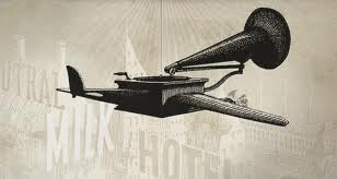
This website belongs to a pretty cool experimental indie band called Neutral Milk Hotel. I like the style of art they used on the website, particularly the flying gramophone on the home page. There is a very simple four-page layout with a charity page that I thought was really cool. A portion of concert proceeds and one dollar from every box set will be donated to children in need. When you click on the page links they open on the bottom of the screen and add colors and images that contrast the grey vibe of the home page.
Neutral Milk Hotel – Gramaphone
San Marcos Photos:
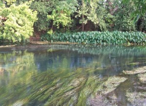
Unfortunately I wasn’t able to take my own photos in San Marcos for the blog project this week because I live in Austin. However, I did find some really great photos on the internet that capture my favorite places in San Marcos. The first picture is of the San Marcos River where I love to hang out and relax, along with everyone else in San Marcos some days. There are few places I enjoy more than the river on a quiet day.
San Marcos River
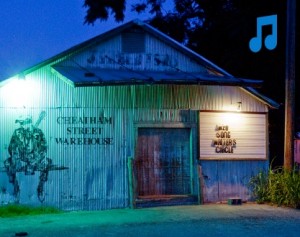
The second photo is of one of my favorite music venues in San Marcos, Cheatham Street Warehouse. This place has a ton of history with some incredible Americana musicians stopping in for shows frequently, including one of my old songwriting teachers Will Sexton who I saw play there several times.
Cheatham Street Warehouse
The last picture is of another place I frequent in San Marcos, Tantra Coffeehouse. This place has some lively music in the evenings; my favorite is bluegrass nights. One of the most impressive young singer/songwriters I’ve seen in the past few years named Grace Park used to work at Tantra (she still might). She is currently playing gigs in Central Texas with a group called Grace Park & the Deer. I highly recommend you check out their music or go to a show if you see their name on a poster around San Marcos.
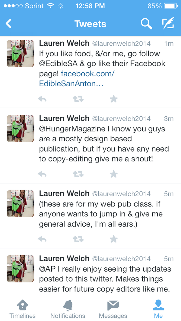
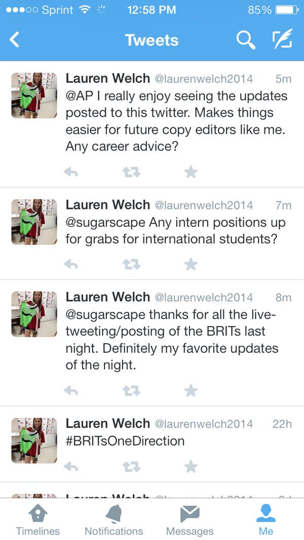
So I decided to make a separate twitter account solely for school/business purposes! I tweeted AP, Sugarscape & Hunger magazine. I hope to eventually work for either publication, and I’m obsessed with AP updates so I decided to tweet them for this post. I asked them about internship opportunities and advice for my future as a copy editor &/or journalist. I also threw in a tweet & link to Edible San Antonio where I’m interning this semester. Do me a solid and follow/like their pages! Here is their Facebook & Twitter links.
The three websites that I think are well designed are Facebook, our Web Design and Publishing, and The Huffington Post. I thought I would list the design principles in the book, and then list how well the websites follow those principles.
Alignment:
Facebook, Web Design and Publishing and The Huffington Post all follow the alignment rule by keeping all of their web content aligned to the left. The only exceptions are the centered headline pages of The Huffington Post.
Proximity:
Facebook– All the stories have their own box that they fit into, with your picture and name right next to your post. So you always know exactly who a post belongs to.
Web Design and Publishing– Every headline is close to whatever it is talking about, and there are not any unnecessary spaces. Areas are boxed off into relevant sections, and then sectioned off again into more specific sections.
The Huffington Post– All the pictures, links, posts, surveys and advertisements are close to what they are talking about. The page has an organized feel even though there is a lot on it. On the page they group sponsored links together, the most popular stories grouped together and the same types of stories together.
Facebook has a nice contrast to it. The blue front on the white background is really easy to read. The headings of profiles use white lifted font so that you can read it easily on top of photos.
Web Design and Publishing and The Huffington Post both have very simple but effective contrasts of black text and a white background that makes it easy to read everything on the page. Every title is bolded for more contrast and to show the most important parts of the page.
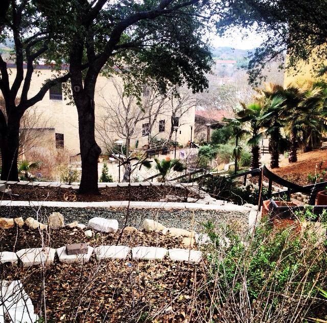
Texas State University started classes in 1903, and the first building built was Old Main. It’s beauty and history makes it one of the most recognizable buildings on campus, which is why I chose it for my first photo.
Old Main: The first building on the TSU campus.
My second photo is of the statue of Lyndon B. Johnson reminds students of the great man that attended our school. The LBJ photo I took also shows a ton of stairs in the background, which is something that every person who has attended Texas State will remember.
Statue of Lyndon B. Johnson, and ALL THOSE DAMN STAIRS!
My third photo is of a garden that I found while I was looking for my class. I think this photo shows all the beauty of the Texas State campus, which is the main reason I decided to move to San Marcos.
I learned some interesting design principles from the reading this week:
Consistent Alignment
You want to use a consistent alignment on your webpages. Don’t center some things and left-align others, and right-align still others. Choose one alignment and stick with it. You want strong lines in your design.
I feel like I mostly do this on my webpages, but I’ve never been following a conscious rule. Mixing alignments really does look funny. It’s nice to know my aesthetic sensibilities are (mostly) correct.
Proximity
Group like things together, so that it’s easier to visually discern relationships between page elements. Headings and subheadings should go with the text they relate to. Squint your eyes a bit and see if you can tell what goes with what, without even having to read.
Paragraph vs. Break
Using a <br/> code instead of <p>aragraph</p> can prevent a big gap between elements. The browser will treat lines that are <br/>oken up as a single paragraph, so it’s good for styling, too.
Repetition
Using a unified style across multiple pages make them all look like the belong to the same website. Since I usually use a CMS (Drupal) with specifically styled themes, this is usually a no-brainer, but having to code individual webpages for this class has reminded me of how important (and irritating) it is to keep everything consistent when you do it by hand.
Contrast
In photography, contrast is a difference between light and dark, and it’s those differences that create an image. In web-design, a similar analogy can be made, that using contrasting fonts and colors can draw the reader’s eye to where you want them to go. Contrast defines what’s important, and develops a logical hierarchy. If everything looks like it has the same priority, then nothing has priority.
I learned the four basic design principles are alignment, proximity, repetition, and contrast. Alignment is what I stress over the most with any design I work with. I like things to be neat and orderly and I feel in web design it’s important to help in keeping continuity page to page.
I asked two voice actors, John DiMaggio and Maurice LaMarche, about what advice they had for people just starting out. I was very frustrated that I was limited to 140 characters, because I wanted to be more specific. I have yet to receive a response, but am anxious about getting some.
I also @replied my improv teacher Amy Jordan. I asked her what she thought it took to get started in comedy.
This was a fun exercise and I’m looking forward to getting some good knowledge.
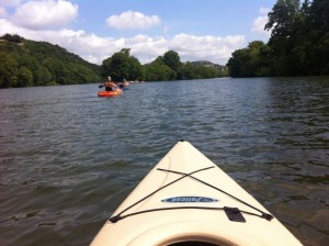 For Project #3 I will be making a site about kayaking. With spring around the corner, this will give me an opportunity to get outside on my kayak more frequently to get some good photos and video to share on my page in addition to some general information about kayaks, where and how to buy them, and the best spots around central Texas to go kayaking.