All posts by Brittani Hammock

Blog Post 9

Browser Wars

I didn’t realize that Microsoft wasn’t interested in the web at first, which is not what I would have thought. I don’t like the way that Microsoft tried to bully everyone.I’ve never really been a fan of Microsoft, and I am even less of one after watching these videos.  I think Bill Gates seems really annoying and like a liar after watching him in the tapes. It kind of confused me when they were talking about Gates doing a lot of philanthropic work, because he seemed very selfish. Another thing I thought was interesting is that Jim Clark is from west Texas, where I am from and, that all the people trying to start Mosaic were so young, its inspiring.

Search

It still shocks me when I am reminded of how short of a time it has been since the internet really took off. It feels like its always been here. I love that Yahoo! (Jerry and Davids Guide) started as a way to win a game, it goes to show that one idea can turn into something huge. I also like how advertising is changing. Even though people don’t like to watch commercials and get irritated by advertising, I think its great that advertising is on the internet. I really like the way Facebook is advertising by advertising to peoples interest by using the internet as a market research tool. I know that is a privacy issue, but I enjoy the advertisements that point me to places I would like to go or things I would like to buy. Another thing that I thought was interesting is how Bill Gross was saying he just tries to fix problems and how to make things better. I think that’s a great way to create things that people will want. Lastly, I also really like Google’s motto “Don’t Be Evil” and the way that they don’t want to bully other companies.

Bubble

I realized that Amazon and Ebay were two huge companies, but I didn’t realize that they were the first companies to sell products online. The things I thought were really neat about how these two companies started were that Amazon started by wanting to make a huge library and that Ebay was made without a business plan, from someones home computer.  Also, it is crazy how fast these companies grew. The way this video explained public key cryptography was really great. I have learned what it is before, but I was really confused on how it worked. Now I understand it even more. I still cannot believe that people still thought the internet was a fad into the late 90s. I liked what was said about the bubble “The pain it caused was the price of progress.” That is something I really believe in. People don’t want to move forward with things, like giving people health care, giving everyone equal rights, recycling, because they don’t want to put in the effort or the money it takes to make progress. The way people were about computers, should be eye opening to people that progress takes work.

People Power

I couldn’t believe the idea of iTunes was started by Shawn Fanning as a teenager. It’s crazy how much the internet has changed society. Who would have thought that teenagers could be making money posting things to Twitter, that you could make and sell your own things on Etsy, or that you could become famous overnight on YouTube. I think it is so interesting to look at how much society has changed in the past few years, and even more interesting to see where it is going.download--the-true-story-of-the-internet
Blog Post 8- Final Project

I am going to do my final project over Texas Carpet Baggers, a handmade bag line in Austin, TX. I helped the out the owner a few Christmas’s ago when she  was just starting her bag line. When I left her things were starting to fall together and her bag line was starting to take off. The reason I want to do this page on TCB is because these bags are unique, handmade and they try to stay local with the materials they use. Another thing that is really neat about her bags is that her husband carves the oak handles and bottoms of the bags himself. These are the pages that I would include

Logo

Home

  • I would have a slideshow of the bags and a brief summary of what TCB is.

About TCB

  • I would interview Becky about what exactly TCB is, and about herself and what made her want to start a bag line.

  • I would have a video interview also.

How Bags are Made

  • Information about how the bags are made, what materials are used, why the bags are so unique, what it mean for the bags to be handmade, and talk about the quality of the bags

  • I would include a video of the process of making the bags.

TCB Bags

– Damn Purse

– Miss Kitty

– Totes

– Overnight bags

  • This section would have a drop down menu where you could click on the different bags that TCB makes, with photos of each bag and a description.

Blog Post 6: Responsive Design Exercise & Project 03 Topic

For Project 3, I am going to make a website about my favorite hobby, exploring! I will post pictures, location information and specific information about the hikes and drives I explore around the Hill Country.

exploring
Scenic drive from San Marcos, TX- Midland, TX

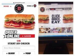
The first mobile-friendly site I chose was for Jimmy Johns… which I use all the time. It has definitely evolved since online ordering started taking off. I remember not being able to get my address to show up correctly, submit buttons not working and pages freezing all the time. Over the past few months they have updated the site, and now I never experience any problems. Jimmy Johns is an example of a responsive site, because it uses the same basic layout and just repositions items on the site to fit whatever device you are using. The site has 2 different layouts, one for using the full desktop screen, and then one that changes when you shrink the window on your desktop to a more streamlined version: this is the version used on my iPhone, too. The sites change enough to optimize your experience for using the site on a mobile device, but it keeps that same theme on any device you are using to view the site.

The full sized desktop site has an order online area at the top, a navigation bar and a logo at the top of the page. It also has more graphics, shows the recent tweet from @jimmyjohns, and shows pictures tagged with #jimmyjohns on Instagram. The site also gives you the option to add Jimmy Johns on Facebook, Twitter, PinterestYouTube and their blog.

The more streamlined version, for smaller windows and mobile devices, has the most important parts of the website on the homepage. It has a tiny logo at the top, a tiny icon for finding a location, it has one graphic, an order online area, and then the navigation menu at the bottom of the screen.

jimmy johns
Jimmy Johns mobile site vs. desktop site

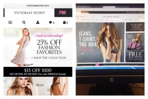
Victoria’s Secret is a good example of a dedicated web site. The desktop version stays the exact same size, no matter how small you make the window you are viewing it in. The desktop site is broken up into sections, each section has a picture of a model with some text and links inside them. The text is mostly advertising some sort of deal like “Free Shipping on Swimwear” or “25% off” and then they link you to areas of the that relate to the deal. They have an area that allows you to sign up for special offers, to login to your account or to search the website for a specific topic. They have a navigation menu for all of their Victoria’s secret products, and another separate navigation menu for all of their Pink products. At the bottom of the website they have limited edition deals, information about the VS credit card, Account information, Customer Service, links to download apps for separate devices and a subscribe area. Also, they have links to the official Victoria Secret Facebook, Twitter, YouTube, Pinterest and Instagram pages.

The mobile site for Victoria’s Secret is much more streamlined than the desktop site, but it still has almost all the same information. It has the separate tags for Victoria Secret and Pink products, and underneath those tabs it has small icons to show where you can click to see a whole menu, where you can search,  your profile, what you like and what is in your cart. Instead of advertising all of their deals they just have the pictures of the models as links to get to the bra, panties, clothing and swim areas. I personally think they should have stuck with showing the different deals, because that is what most people are interested in when shopping. Then they have all your account information, card information, App information and Subscription information at in a drop down menu. I feel like the mobile site has a little too much information on it, and they could have done a better job at only putting the most clicked areas on the home of the mobile site. Even though there is a lot of information, they still did a good job at organizing mobile site, with the most important information toward the top of the page.

Victorias Secret
Victoria’s Secret mobile site vs. desktop

Blog Post 5: Good Sites and Texas State photos

The three websites that I think are well designed are Facebook, our Web Design and Publishing, and The Huffington Post. I thought I would list the design principles in the book, and then list how well the websites follow those principles.


Alignment:

Facebook, Web Design and Publishing and The Huffington Post all  follow the alignment rule by keeping all of their web content aligned to the left. The only exceptions are the centered headline pages of The Huffington Post.


Proximity:

Facebook– All the stories have their own box that they fit into, with your picture and name right next to your post. So you always know exactly who a post belongs to.

Web Design and Publishing– Every headline is close to whatever it is talking about, and there are not any unnecessary spaces. Areas are boxed off into relevant sections, and then sectioned off again into more specific sections.

The Huffington Post– All the pictures, links, posts, surveys and advertisements are close to what they are talking about. The page has an organized feel even though there is a lot on it. On the page they group sponsored links together, the most popular stories grouped together and the same types of stories together.


Repetition:

Facebook, Web Design and Publishing and The Huffington Post all follow the same repetition rules,  they stay with the same font, color, logo and basic layout from page to page.


Contrast:

Facebook has a nice contrast to it. The blue front on the white background is really easy to read. The headings of profiles use white lifted font so that you can read it easily on top of photos.

Web Design and Publishing and The Huffington Post both have very simple but effective contrasts of black text and a white background that makes it easy to read everything on the page. Every title is bolded for more contrast and to show the most important parts of the page.

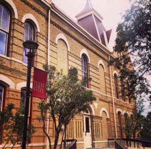
Texas State University started classes in 1903, and the first building built was Old Main. It’s beauty and history makes it one of the most recognizable buildings on campus, which is why I chose it for my first photo.

Old Main
Old Main: The first building on the TSU campus.

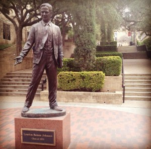
My second photo is of the statue of Lyndon B. Johnson reminds students of the great man that attended our school. The LBJ photo I took also shows a ton of stairs in the background, which is something that every person who has attended Texas State will remember.

LBJ
Statue of Lyndon B. Johnson, and ALL THOSE DAMN STAIRS!

My third photo is of a garden that I found while I was looking for my class. I think this photo shows all the beauty of the Texas State campus, which is the main reason I decided to move to San Marcos.

garden
TSU’s own secret garden

Blog Post 4: Twitter Exercise 2

Let me tell you… designing your own website is both WAY more difficult than you would think… but at the same time it is surprisingly simple and easy. I feel like designing your own website is like the question, “Which weighs more? 100 lbs of bricks or 100 lbs of feathers?”… The answer is simple, but if you over think it you will end up not knowing what to do. And I am the QUEEN over over thinking so obviously I had a hard time trying to set up my Balsamiq and designing the wireframe for my website.

Thats when I decided that I should try to read the chapter from The Non-Designer’s Design Book that @_caryanne assigned to us. I was really taken aback at how interesting and easy  the chapter was to read and understand, and how much it helped me with getting my wireframe started.

The chapter starts with talking about alignment and how important it is to keep the same alignment throughout your webpage. The chapter said that if you mix alinements (like center and left) it makes your webpage look sloppy and makes it hard for your user to understand the flow of your webpage. So that was the first thing I fixed on my webpage. The chapter said that center alignment wasn’t the ideal alignment to use, but I liked the look of it so that’s what I stuck with.

Then the chapter moved to the importance of proximity on your webpage. I hadn’t really thought about the importance of the proximity of my headlines to my paragraphs. When I looked at all the examples given, I could see how putting too many spaces between parts of my site that are supposed to go together, can make those parts look like they aren’t supposed to be grouped together. So I fixed all those issues on my wireframe.

The rest of the reading talked about repetition and contrast of webpages. Before I had read this chapter I already had an idea about those two elements, and had incorporated them into my design. It was helpful to know why these elements were so important to design. Repetition is important because it makes your pages seem like they fit together and not like separate people designed every separate page of your site. Contrast is important because it makes it easier for your user to read, and also can point out the most important parts of your page.

All in all, the chapter really made my webpage design much simpler, and I felt a little silly for freaking out so much about how to design my page. I will definitely be reading all the assigned readings before I try to tackle our next assignment!


Now, for the Twitter assignment.

I had a little bit of a hard time with this assignment, basically because I still don’t know what I want to do after I graduate. All I know for sure is that I want to do something in the communications field, so I googled the top Public Relations and Marketing Pros on Twitter.

The first person I tweeted was Philip Parancias who describes himself as an “Industrial/B2B digital marketing specialist, blogger/author, speaker. New York.”

I asked him: @Flip2Market I am a student at and I was wondering what digital marketing tools you think are the most useful?

He replied: Hi @brittaniii there are many. Here are a few faves: For social – @hootsuite, email – @myemma for integrated/automated – @hubspot.

The second person I tweeted was Kathy Jacobson who describes herself as “A full-service public relations, brand building & cause marketing agency representing sports, lifestyle, fashion, philanthropy, events & consumer brands.”

I asked her: @KathyJacobsonPR I am a PR major at TXState and was wondering if you have any advice on what has helped you become so sucessful?

She replied: @brittaniii what a cool tweet! I would say work hard,learn everything you can, intern,volunteer,never give up & never ever quit. #girlpower

The third person I tweeted was Dorothy Crenshaw who describes herself as “CrenshawComm.com  #PR. Word nerd. Fiction fan. Adoptive mom. Fitness buff. PR,communications, social TV, marketing, tech, media, politics, popculture”

I asked her: @dorocren I am a PR major at TXState & I was wondering: What do you think the are the most important qualities of a PR pro?

She replied: @brittaniii Writing/content skills, verbal comms, media sensibility, renaissance knowledge (knowing re many things), intellectual curiosity

I was EXTREMELY surprised that every person I tweeted, tweeted me back. Everyone gave me great advice. This assignment has showed me how helpful Twitter can be, and how I need to keep tweeting and stop resisting Twitter.

Blog Post 3: Twitter Exercise and Improving Posts (Brittani Hammock)

Hello All!

I have had a Twitter for almost three years, so you would think I would know how to retweet by now but I couldn’t figure out how to do it. Obviously there is the easy way, to just hit the “Retweet” button, but I couldn’t figure out how to copy a post, how to get it to show up correctly, I wasn’t sure where to put my comment or exactly how and where to put the RT.  I finally looked up Different Ways to Retweet Someone to make sure I was doing it correctly, and it wasn’t as difficult as I was trying to make it. I also had a little trouble finding something I wanted to tweet about. I guess that means I need to follow some more people, or just look through old post of the people I started following last week. Anyway, I eventually found two articles that I thought were worthy of a retweet.

tweets
Hopefully I did my retweets correctly

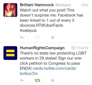
My first retweet I did by just pushing the “Retweet” button. That was definitely easier than trying to figure out how to retweet by copying the post. I chose to retweet @HRC because it’s close to my heart and I think everyone should know that people can still get fired for who they choose to love (this is 2014, COME ON!).

My second retweet was the one I had the most trouble with. I wanted to find something that was relevant to #webpub so I thought this post from @UberFacts was perfect. One out of five divorces is linked to Facebook, which is a great example of how Facebook is effecting our society.

Hopefully, with more practice I will be using and enjoying Twitter by the end of this semester!

Blog Post 2: History of the Internet and Web

Interaction Design Tactics For Visual Designers By Jeff Gothelf

            This post definitely made me think about what makes up a website and what makes it usable. Understanding the Before and After was something that I hadn’t really thought about before, and now I see what is so important about making sure you know where your consumer is going. When someone clicks a part of your website, or even just pushes back, that your website gives them feedback that helps them understand where they are why your website is doing what it is doing.

In Defense of Eye Candy by Stephen P. Anderson

          I really liked how this reading made me think about the “personality” of web pages. After I thought about it, I totally agree with everything that this reading said. There have been many times that I decided I didn’t like an app or didn’t download an app just because of its appearance. My favorite example they talked about was the puppy robot and how they made it a puppy because when a puppy doesn’t do something you tell it to, you think it is cute. If they would have made it a butler and it didn’t do what you asked it to do, you would just think it was broken and annoying.

Inclusive Design By Faruk Ateş

          I’ve never really thought about user interface before, but now I am seeing how important it is. I definitely agree that I don’t always know what I want, and if an app or web site could sense that for me that would be awesome. For instance, I think it would be really awesome if my iTunes could be better at predicting my songs that play on my shuffle. I have thousands of songs, but most days I am feeling one type of music. If I keep selecting more mellow songs, it would be great if my iTunes wouldn’t keep shuffling to rap songs, and instead just learned what I was into that day from my previous selections.

History of the Internet by Ethan Zuckerman

          I never knew that when the internet started out that one of the main uses for communication, and I was shocked that it all started in 1969. After watching this video I really understand how the internet has been used as a communication device since it was invented, through chat rooms, gaming sites, email and social media.

Nerds 2.0.1-Timeline (PBS)

          This site made me realize how much has happened for the internet to be where it is today, in such a short amount of time. It really makes me wonder: What will the internet be like in 20 years? If it keeps growing like it has been, the possibilities are endless!

The Internet: A Decade Later

          WOW! I can’t believe it used to take 12 minutes to download a song, and now it only takes 18 seconds. That is crazy! The strange part is that I was downloading songs then, and wasn’t even bothered by how long it took… I can’t imagine waiting that long today. I also remember when Yahoo! looked like it did in 2002. Oh the memories!

The First Website

          I can’t believe how far the web has come! I remember somethings similar to this setup when my family first got a computer.

How search engines work

          I had learned about the spiders and how search engines work in my CS1301 class, but this graphic really made it make more sense.

The Power of Google

          WOW! This reading was really helpful. The tools they show you to use to help narrow your search make total sense (for example using “-SATs” to not include SATs in your search). Google Scholar will also be particularly helpful for my research methods class when I have to find previous research on my topic. I knew most of the keyboard shortcuts, but I didn’t know how to screenshot my computer… so that will be helpful. This will definitely be a website that I revisit!

          After reading these articles, I got really inspired. I feel like I could possibly have a future in designing user interface  and learning interaction design tactics. So that brings me to my Twitter account. I haven’t ever really used my Twitter before, but today I thought I would clean it up a little and follow more people. I didn’t know where to start, but I knew that I wanted to follow more news organizations and someone that posted about media design (because I am really loving all these articles). So I started following @GirlsinTech,  @BBInteractive, @WebDesignShock, @NCWIT and @uxmag. I basically went through who @_caryanne was following and clicked on the ones that had the most web design articles that looked interesting to me. Hopefully following more interesting posters will make Twitter something I use more!

Blog Post 1: Brittani Hammock

Hello!

My name is Brittani Hammock (My Twitter is @brittaniii), and I am a senior at Texas State. I am from a small town in west Texas called Greenwood, and moved to San Marcos with my girlfriend (Tedye), my 2 cats (Penny and Tiger) and my dog (Tucker). I LOVE San Marcos because it is SO much more beautiful than the flat, brown, dusty area I am from.

2 cats and a dog
Penny, Tiger and Tucker

For a class last semester I even wrote a blog about how much I love the area around here. Now that I am surrounded by all this greenery, rolling hills and water spots I couldn’t imagine living anywhere else. I love to hike, explore and take in as much of the beauty of the Hill Country as possible.

greenwood tx
Greenwood= flat, brown, dusty
san marcos tx
San Marcos= green, beautiful, clean

I’ve changed my major a few times (nursing, education, psychology, advertising) and now I am majoring in Public Relations with a minor in Psychology.  I wouldn’t really say that PR is my passion, I basically chose this major because I felt like I could really do anything with it. Everyone needs an employee who can communicate properly, right? My dream job would be doing something that involves my creative side, which is the main reason I am taking this class. I know that website design will look great on my resume, and hopefully if I get good enough at it then I can incorporate my creativity into my website designs.

I’ve taken 2 classes that gave me some basics on web design last semester (Fundementals of Online Media, and CS1308) and I really enjoyed them. I was especially glad that I had those 2 classes under my belt on the first day of our Media Design class, it helped out a lot. I’m hoping by the end of this class I will be able to code without having to have a template to look at, work WordPress flawlessly, have a better understanding of Photoshop, and become faster at editing videos. I’m really excited about all this class has to offer and plan to take advantage of all our learning opportunities. I hope everyone has a great semester!