For Project 3, I am going to make a website about my favorite hobby, exploring! I will post pictures, location information and specific information about the hikes and drives I explore around the Hill Country.

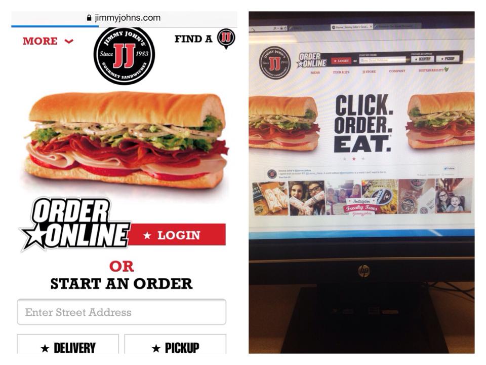
The first mobile-friendly site I chose was for Jimmy Johns… which I use all the time. It has definitely evolved since online ordering started taking off. I remember not being able to get my address to show up correctly, submit buttons not working and pages freezing all the time. Over the past few months they have updated the site, and now I never experience any problems. Jimmy Johns is an example of a responsive site, because it uses the same basic layout and just repositions items on the site to fit whatever device you are using. The site has 2 different layouts, one for using the full desktop screen, and then one that changes when you shrink the window on your desktop to a more streamlined version: this is the version used on my iPhone, too. The sites change enough to optimize your experience for using the site on a mobile device, but it keeps that same theme on any device you are using to view the site.
The full sized desktop site has an order online area at the top, a navigation bar and a logo at the top of the page. It also has more graphics, shows the recent tweet from @jimmyjohns, and shows pictures tagged with #jimmyjohns on Instagram. The site also gives you the option to add Jimmy Johns on Facebook, Twitter, Pinterest, YouTube and their blog.
The more streamlined version, for smaller windows and mobile devices, has the most important parts of the website on the homepage. It has a tiny logo at the top, a tiny icon for finding a location, it has one graphic, an order online area, and then the navigation menu at the bottom of the screen.
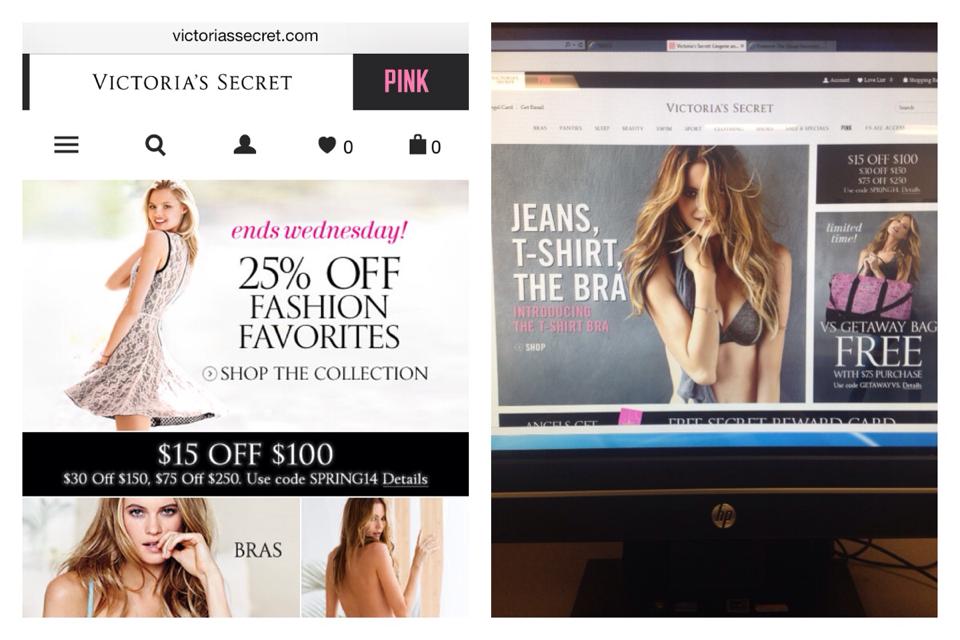
Victoria’s Secret is a good example of a dedicated web site. The desktop version stays the exact same size, no matter how small you make the window you are viewing it in. The desktop site is broken up into sections, each section has a picture of a model with some text and links inside them. The text is mostly advertising some sort of deal like “Free Shipping on Swimwear” or “25% off” and then they link you to areas of the that relate to the deal. They have an area that allows you to sign up for special offers, to login to your account or to search the website for a specific topic. They have a navigation menu for all of their Victoria’s secret products, and another separate navigation menu for all of their Pink products. At the bottom of the website they have limited edition deals, information about the VS credit card, Account information, Customer Service, links to download apps for separate devices and a subscribe area. Also, they have links to the official Victoria Secret Facebook, Twitter, YouTube, Pinterest and Instagram pages.
The mobile site for Victoria’s Secret is much more streamlined than the desktop site, but it still has almost all the same information. It has the separate tags for Victoria Secret and Pink products, and underneath those tabs it has small icons to show where you can click to see a whole menu, where you can search, your profile, what you like and what is in your cart. Instead of advertising all of their deals they just have the pictures of the models as links to get to the bra, panties, clothing and swim areas. I personally think they should have stuck with showing the different deals, because that is what most people are interested in when shopping. Then they have all your account information, card information, App information and Subscription information at in a drop down menu. I feel like the mobile site has a little too much information on it, and they could have done a better job at only putting the most clicked areas on the home of the mobile site. Even though there is a lot of information, they still did a good job at organizing mobile site, with the most important information toward the top of the page.