The three websites that I think are well designed are Facebook, our Web Design and Publishing, and The Huffington Post. I thought I would list the design principles in the book, and then list how well the websites follow those principles.
Alignment:
Facebook, Web Design and Publishing and The Huffington Post all follow the alignment rule by keeping all of their web content aligned to the left. The only exceptions are the centered headline pages of The Huffington Post.
Proximity:
Facebook– All the stories have their own box that they fit into, with your picture and name right next to your post. So you always know exactly who a post belongs to.
Web Design and Publishing– Every headline is close to whatever it is talking about, and there are not any unnecessary spaces. Areas are boxed off into relevant sections, and then sectioned off again into more specific sections.
The Huffington Post– All the pictures, links, posts, surveys and advertisements are close to what they are talking about. The page has an organized feel even though there is a lot on it. On the page they group sponsored links together, the most popular stories grouped together and the same types of stories together.
Repetition:
Facebook, Web Design and Publishing and The Huffington Post all follow the same repetition rules, they stay with the same font, color, logo and basic layout from page to page.
Contrast:
Facebook has a nice contrast to it. The blue front on the white background is really easy to read. The headings of profiles use white lifted font so that you can read it easily on top of photos.
Web Design and Publishing and The Huffington Post both have very simple but effective contrasts of black text and a white background that makes it easy to read everything on the page. Every title is bolded for more contrast and to show the most important parts of the page.
Texas State University started classes in 1903, and the first building built was Old Main. It’s beauty and history makes it one of the most recognizable buildings on campus, which is why I chose it for my first photo.

My second photo is of the statue of Lyndon B. Johnson reminds students of the great man that attended our school. The LBJ photo I took also shows a ton of stairs in the background, which is something that every person who has attended Texas State will remember.

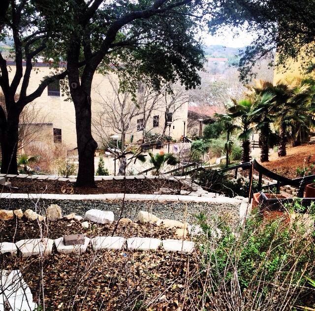
My third photo is of a garden that I found while I was looking for my class. I think this photo shows all the beauty of the Texas State campus, which is the main reason I decided to move to San Marcos.