Tomorrow, I hope to cover the East Austin Urban Farm Tour, visiting four farms in Austin that are working to bring local food to the community.
This, despite the fact that Texas was recently voted the number 1 worst state to eat locally, based on the number of farmers markets, CSAs (Community Supported Agriculture), food hubs and the percentage of school districts with farm-to-school programs.
I don’t really know the story, yet. My press credentials haven’t even gone through yet, I’ve been communicating with the PR lady for the past week. So, I’m not really sure what my final project is going to be. But, this topic seems interesting and important to me, so I’m going to give it a whirl.
Anyway, that’s it. Wish me luck. And meet me back here next week to see how it pans out!
For my third project, I want to design a website for a Youtube series I’m working on called Texas Food Crawlers, because not only do we need a website, but I also need a good grade!
I’ve been wanting to fool around with the Zurb Foundation framework, which I’ve been reading up on. It looks perfect for a tidy, responsive website like the one I want. But, in the spirit of learning, I’m determined to code the website’s HTML and CSS by hand first and then convert it over to Foundation later on.
B&H Photo is one of my favorite websites, because I like to dream and drool about all the gadgets and gear they sell. I’ve never actually looked at it on my phone though. They have a dedicated mobile version with big buttons and text that differs quite a bit from their desktop version, which is is not responsive, but has a very nice fixed grid design jam-packed with cameras, computers and accessories.
Mashable is a fun website with a clean, responsive design that looks great on mobile phones, tablets and computers. On a desktop, it has a two column grid with loads of stories and advertisements crammed into it, and with a left-handed sidebar showing a running feed of the newest stories. A navigation bar sticks to the top of the screen at all times, allowing you to dive deeper into the rabbit hole. On a mobile phone, everything collapses into a single, long column and the navigation bar becomes a button menu, with a drop-down search option. Very clean, very nicely done.
Apple is well respected for their attention to design, and their website is no different. Clean and minimalist and very, very focused. They mostly use a centered alignment for the elements on their page and everything is grouped together in a coherent way. They use a varied mixture of text, pictures and videos to sell their products and the design elements of each page, which are unique to their function, all use the same, sharp, minimalist theme.
Ars Technica is one of my favorite science / tech blogs; they have some of the best technical and specialized writers out there. Their website — built on WordPress, I believe — is also very well designed, using a dark, heavily customized theme. It’s a very text-heavy site, left-aligned and the articles are grouped together with specs, pictures and contrasting headers.
The Verge is another great tech blog, and they use a much more experimental, modern design than either Apple or Ars Technica does. They don’t seem to care too much about optimization — you must be prepared for very long load times if you want to read this blog! But they seem to want their website to imitate the feel of a high-tech magazine. Their content is also very text-heavy and left-aligned, organized in blocks with various sizes and very interesting to look at, although maybe a bit cluttered to the eye.
I learned some interesting design principles from the reading this week:
Consistent Alignment
You want to use a consistent alignment on your webpages. Don’t center some things and left-align others, and right-align still others. Choose one alignment and stick with it. You want strong lines in your design.
I feel like I mostly do this on my webpages, but I’ve never been following a conscious rule. Mixing alignments really does look funny. It’s nice to know my aesthetic sensibilities are (mostly) correct.
Proximity
Group like things together, so that it’s easier to visually discern relationships between page elements. Headings and subheadings should go with the text they relate to. Squint your eyes a bit and see if you can tell what goes with what, without even having to read.
Paragraph vs. Break
Using a <br/> code instead of <p>aragraph</p> can prevent a big gap between elements. The browser will treat lines that are <br/>oken up as a single paragraph, so it’s good for styling, too.
Repetition
Using a unified style across multiple pages make them all look like the belong to the same website. Since I usually use a CMS (Drupal) with specifically styled themes, this is usually a no-brainer, but having to code individual webpages for this class has reminded me of how important (and irritating) it is to keep everything consistent when you do it by hand.
Contrast
In photography, contrast is a difference between light and dark, and it’s those differences that create an image. In web-design, a similar analogy can be made, that using contrasting fonts and colors can draw the reader’s eye to where you want them to go. Contrast defines what’s important, and develops a logical hierarchy. If everything looks like it has the same priority, then nothing has priority.
I’ve had a Twitter account for several years, but I only post on it sporadically — in fact, until last year, I had a two-year gap in my outgoing timeline. I lurk on Twitter a lot, but I get a little bored with celebrities’ constant self-promotion. It is a nice way to share ideas and I’m going to make an effort to use it more. And, now, because of this class, I guess I’ll have to do!
I rarely if ever use Twitter on my computer; I’ve always used an iPhone app. I can’t remember which app I used in the beginning, but I’ve used Twitter’s official one since it was released.
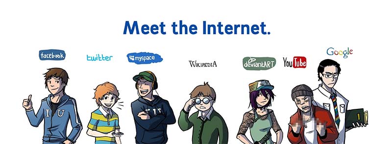
The Internet has always been used for communicating.
1965 – Email is invented.
1969 – The Internet (Arpanet) started.
1978 – First BBS (CBBS)
1979 – MUDs precursor to MMORPG. (Like World of Warcraft.)
1979 – Invention of the emoticon!
1982 – Birth of Instant Messaging.
1990 – World Wide Web. (CERN)
1995 – Geocities and Tripod.
1997 – Weblogs. (Blogs)
1995 – Ward Cunningham creates the Wiki.
2001 – Wikipedia.
2006? – “Today,” 68.6% Americans are connected to the Internet.
According the Pew Research Center’s Internet & American Life Project, as of September 25, 2013 85 percent of Americans aged 18 and older use the Internet.
In response to the Soviet launch of Sputnik in 1957, The United States formed the Advanced Research Projects Agency (ARPA) within the Department of Defense. This timeline describes the events leading up to and following the invention of the ARPANet, the foundation of today’s Internet.
In 2002, high-speed broadband access became available to the public, but most Internet users were still on dialup. Back then, 569 million people (9.1 percent of the world’s population) used the Internet, for an average of 46 minutes per day. There were about 3 million websites online and it took about 16 seconds to load up a typical webpage. Ninety-five percent of users used Internet Explorer. These were the days of Napster and back then, it took 12.5 minutes to download a song on a 56k modem. Friendster, the most popular social network in the world had 3,000,000 users. Tower Records and Borders books were the most popular ways to buy music and literature and Blockbuster was the most popular place to rent movies.
In contrast…
In 2012, 2.27 billion people used the Internet (33 percent of the world’s population) for an average of about 4 hours per day. There were about 555 million websites online and it took about 6 seconds to load up a typical webpage. In 2012, only 39 percent of users used Internet Explorer; 28 percent used Chrome, 25 percent used Firefox and 6 percent used Opera. Napster was long gone, but digital music was as popular as ever; it only took about 18 seconds to download a song. Facebook was the most popular social network, with 900 million users. In 2012, iTunes and Amazon.com were the most popular places to buy music and books online, and Netflix was the most popular way to rent movies. Tower Records, Borders Books and Blockbuster have all gone bankrupt.
This swirly, avant-garde, artsy graphic describes how all the different web technologies are woven together to create the modern World Wide Web. It’s very interesting to play with, but any hard information it may convey is a bit muddled by its presentation.
This animated slideshow describes how a bunch of creepy spiders crawl around on webpages, collecting and storing the data in a search engine’s databases, which index it and serve it back to users based on the keywords they enter, as a webpage full of linked results.
This website very usefully explains how to “program” Google searches to refine the results in a very granular fashion. I’ve bookmarked it for future reference!
My new Twitter Activity
On Twitter, I started following @BradyHaran, because he’s one of my favorite video journalists — the guy behind the Numberphile and Sixty Symbols YouTube Channels. Also, I followed @danharmon because he’s one of my favorite television writers and @stephenfry because he’s just plain amazing.
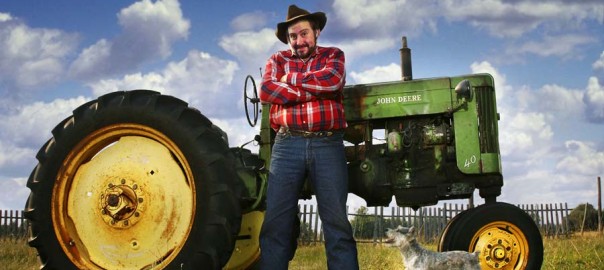
Howdy, y’all! My name is Jax Stafford and I’m a freelance writer and filmmaker from Austin. I’m currently at Texas State University working to finish my degree in journalism.
I’ve worked in the local film industry for a few years, doing low budget indie movies, commercials and a bit of TV. I own a production company called Nickel Slick, for which I write and develop corporate websites and videos. I’ve been coding in HTML since the early 2000s and I’m hoping to use this class to hone my development skills to a fine, deadly point.
As far as spare time goes, I don’t have much, but I like music — both listening to and composing it (I’m very much an amateur), watching movies, writing short stories, drawing, swimming, long walks on the beach, etc.
My future career will be something in video production and I’d like to shoot documentaries as well as my own films. Last year, I started working with both the Escoffier Culinary School and a new local food magazine developing a web series called Texas Food Crawlers.
I have a Twitter account at @jaxstafford and also a Facebook page. I’m looking forward to meeting and collaborating with all you talented people!